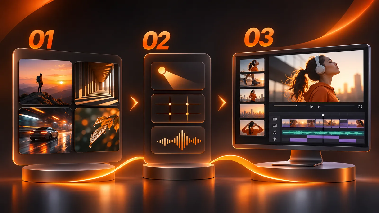
Workflow and delivery

Visual Inspiration for Editors and Designers: From Research to Original Work

What visual inspiration actually means

Visual inspiration is more than spending an hour scrolling past attractive images. It is practice in noticing decisions. Why does one shot feel quiet? Where is the subject placed? How does an edit guide your eye? Why is a website easy to understand despite having many sections? The useful part is writing down an answer you can test in a new project.

Browsing starts with curiosity. Research starts with a question and ends with a decision. For a reel about a small product, investigate how filmmakers communicate scale and use. For a services page, study the order of information and the rhythm of scrolling. Every useful reference should teach you something you can describe in words, even if none of its final styling appears in your work.

Start with the project, not an inspiration website

Write a five-sentence brief: Who is the audience? What single idea should they understand? Where will they see the work? What should it feel like? What are the real constraints of time, footage and brand? That brief keeps an impressive but irrelevant reference from becoming your direction.

Imagine a vertical reel about a desk lamp for people who work at night. It should show how the lamp makes details easier to read, feel warm and calm, and be filmed on a phone with one light. Your search now has a job: close views of small objects, honest lighting comparisons, safe space for captions and cuts that make the action clear. A dazzling reference that hides the lamp behind effects is less useful, however polished it looks.

Name the kind of reference you need

Do not put every attractive thing in one folder. A still-image reference answers questions about framing, light and distance. A motion reference answers questions about timing and transitions. A sound reference reveals how dialogue, music and effects work together. A structural reference shows the order of promise, proof and result. A website reference shows navigation and hierarchy at different screen sizes.

Save each reference with one sentence explaining its job: “empty space to the right of the person for a two-line title,” or “the transition lands after the hand finishes moving.” That note matters more than the thumbnail. A week later, you will know why it was saved and whether it still helps. If you cannot name a useful property, do not save it merely because it looks good.

Where to look: visual research sites by task

Behance helps you examine whole creative projects rather than isolated frames. Search by industry and output, such as “brand film” or “editorial website,” then inspect the full case study. How is the work introduced? Which images explain the choices? Is the actual result clear? Behance’s discovery guide describes search and curated galleries.

Are.na works well as a long-term research archive. Collect images, links and notes in channels, and connect ideas instead of losing them in open tabs. Its channel guide explains how content blocks and channels can be organized. Name a channel after the problem you are solving, rather than “nice things.”

ShotDeck lets you research cinematic frames by lighting, color, camera angle and subject distance. Study a frame to understand what its light or composition accomplishes, then test what is feasible with your own resources. The platform describes itself as a searchable film-still library; check its current access and usage terms before relying on it.

Art of the Title focuses on title sequences in film, television and related work. Use it when you are deciding how to introduce a name or create visual anticipation before a story starts. Read the story behind a sequence; a single screenshot cannot explain its timing.

Vimeo Staff Picks offers carefully selected films. Watch for scene construction, pacing and the moment before a cut. The timing of a transition cannot be judged from a still. Vimeo’s explanation says its curation team updates selections continuously.

Awwwards is useful for website interaction, scrolling and responsive design. Try the website itself instead of studying a screenshot. Can you find the information quickly? Does it work on a phone? Does animation help reading? The site offers categories and tags such as portfolio, scrolling and responsive.

Pinterest is useful for broad discovery and quick boards. Explore directions such as paper texture or warm light, then follow the original source when you need context. Pinterest’s board guide explains how ideas are collected and organized. A reposted image is not permission to use it in your published work.

Search with questions, not vague keywords

A query such as “cinematic video” is so broad that an algorithm makes most of your choices. Combine subject, decision and medium instead: “product close-up warm practical light,” “editorial portfolio case study mobile,” “restrained Arabic kinetic type,” or “interview cutaway hands workbench.” Search in more than one language when appropriate; terminology differs, and one query may reveal work the other misses.

Start with ten results, select only three for close analysis, and change the query if none answers your question. Give research a time limit before you begin so browsing does not replace making. Archive a beautiful reference that conflicts with the audience, budget or brand; do not force it into the current project.

Analyze one reference in five minutes

“The colors are nice” is not analysis. Write five notes. Purpose: what should the viewer understand or feel? Attention: where does the eye go first and second? Mechanism: which choice caused that, such as scale, pause length or light direction? Constraint: what resources made the result possible? Translation: how could the principle work with different material?

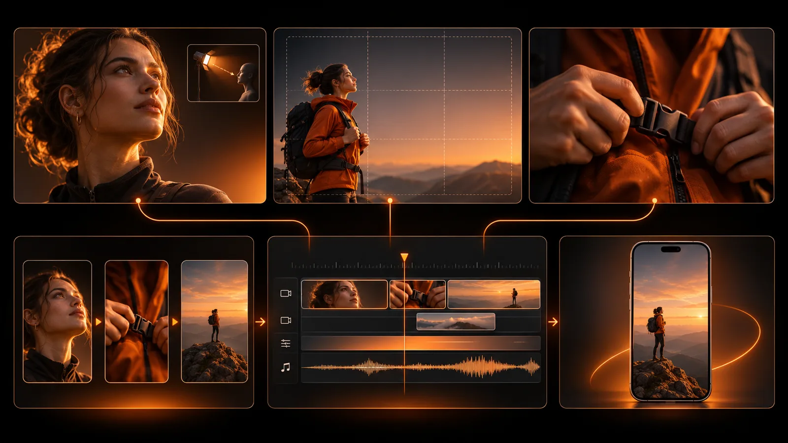
If a person beside a window catches your attention, do not recreate their clothes and exact frame. Perhaps the useful lesson is separating a subject from the background with contrast, or leaving context visible around them. Test those principles in your own location. The image below traces a wider process: collect references, isolate light, composition and rhythm, then make a new edit with your own footage. The source material changes; the useful decisions survive.

Analyze video in time, not only as stills

Pause at four moments: the first second, the first important change, the moment the idea becomes clear and the ending. Record what changes between them. Is it the camera, the story, the audio or the information? Estimate the length of a pause when it matters, but do not turn another film’s timing into a fixed formula for your reel. Shot duration depends on how much information a viewer needs to read.

Watch once with sound and once without it. Silent viewing makes framing, text and sequence easier to notice. Listening without looking reveals where tension begins or resolves. Separating these layers helps you choose what to adapt. If you are editing reels, see our guide to hooks and audience retention.

From frame references to light, composition and rhythm decisions, then an original edit on the timeline.

Analyze a website as a user journey

Open the page and ask: what do I understand in the first screen? Where is the evidence for its promise? How do I reach the work, price or contact page? What happens on a narrow screen? Do not let a beautiful 3D scroll distract you from reading and navigation. An experimental site may demonstrate impressive engineering while being a poor model for a service page that needs speed and clarity.

Capture only three moments: the beginning, the proof and the next step. Under each screenshot, write what its arrangement achieves. If a headline is enormous, ask whether it guides a decision or pushes essential information several screens down. Visual research sometimes teaches what to remove rather than which effect to add.

Build a moodboard that explains a decision

A useful moodboard is a short document: the project idea, three to six chosen references and one sentence under each explaining its role. Organize it around image and light, type and composition, motion and rhythm, and sound if the project is a video. Ten pictures saying the same thing make a decision harder. Include a counterexample when needed: “warm and readable, without glare that hides the product.”

Present a client with choices of principle rather than three complete sites from which they are expected to pick one to copy. Ask whether the amount of motion suits the audience and whether the image actually represents the product. After agreement, make a test frame or short clip. A moodboard without a practical test may create agreement about taste while hiding the production constraints.

Turn the moodboard into a shootable storyboard

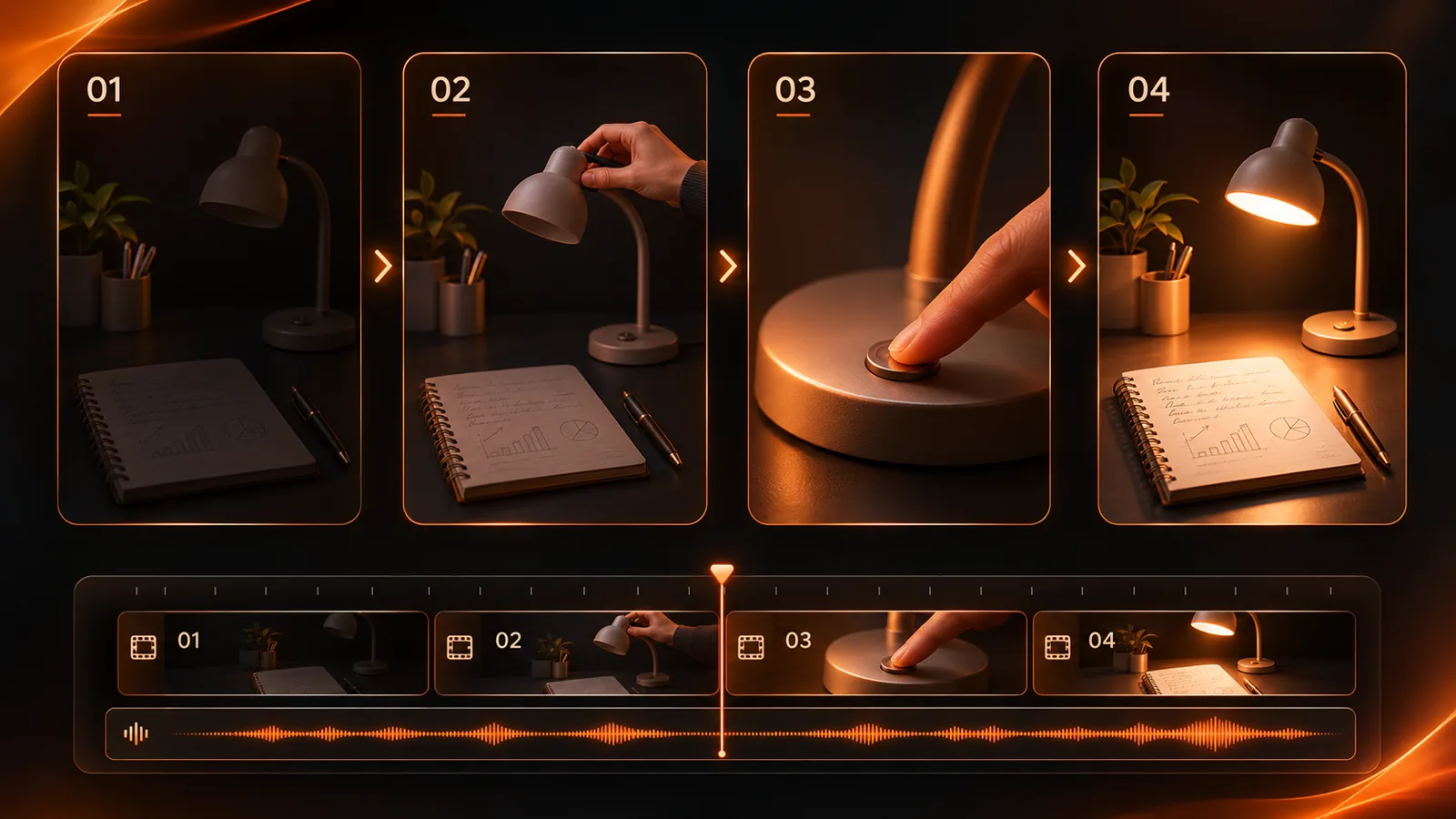
Take the desk-lamp example. One reference suggests beginning with a visible problem; another suggests a close view of the switch; a third shows how consistent hand direction helps continuity. Your new storyboard is not those images pasted together. It is four shots of your own product: difficult reading, lamp introduced, switch pressed and a clearer page seen from almost the original position.

For each shot, write what the viewer sees, what information they gain and what must be captured for the cut to work. You may discover that the result shot needs different lighting or that the caption covers the switch. Finding that out on paper is cheaper than discovering it after filming. Our product-video shot list offers a broader example.

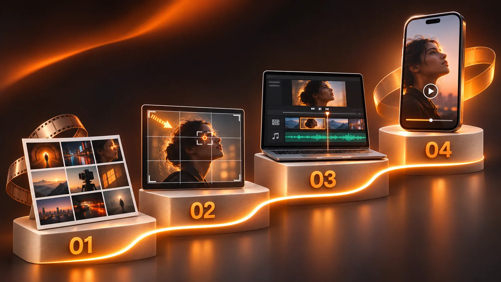
A selective editing board: light, framing and a detail shot become an ordered sequence with sound and a finished reel.

Choose color without copying a LUT

Separate the color of the object, the color of the light and the grade. A warm image may owe its look to a lamp in the frame and beige walls, not to a global orange filter. Examine skin tones, shadow direction and background contrast before copying any numerical settings. With ready-to-use Rec.709 footage, exposure correction, white balance and shot matching may be sufficient before a restrained creative finish.

Put three frames from your own project side by side and test the idea. Does the product still look like its real color? Can the text be read? Does the last scene look unrelated to the first? A reference helps you name a feeling; a LUT alone does not deliver it. See our color correction versus color grading guide.

Four shots on an editing timeline: a dim page, the lamp setup, the switch and the illuminated result.

Sound belongs in visual research too

The term is visual, but we understand picture rhythm through sound. If a reel has a satisfying transition, ask whether the beauty comes from the cut or a musical pause before it. Does a sound effect explain a movement or merely decorate it? Store an audio note beside the visual reference instead of hoping you will remember it later.

In your own edit, make one version with dialogue and necessary effects only, then add music. If an important word disappears under an impact sound, move or soften that sound. Do not simply reuse copyrighted music or a protected effect from a reference. Identify its function and achieve that function with material you can use. Our sound-design guide for Instagram reels explores these layers.

When does inspiration become copying?

Here is a practical test: if someone can instantly name your source because the shot order, palette, typography and motion are all the same, you are too close. Learning a broad principle such as “show proof before explanation” differs from recreating a distinctive shot or visual identity. Treat a reference as a lesson, and keep its creator and source URL in your research log.

An image appearing on Pinterest or Behance does not automatically grant permission to publish it in an advertisement or on your website. Some references are suitable for internal discussion while public use requires a license or explicit permission. Even where a particular quotation is legally allowed, a client project needs an identity that belongs to its brand. Combine sources from different disciplines and return to the project’s own audience, constraints and material.

Mistakes that make research noisier

Collecting without categories: a hundred images called “inspiration” are harder to use than six documented references. Choosing form first: picking a transition before the message makes the story serve the effect. Staying in one industry: this can lead to copying an established style instead of solving the project. Judging from thumbnails: video and websites unfold over time and through interaction. Ignoring resources: a large studio production needs adapting to your equipment, location and schedule.

The answer is not to close inspiration sites. Give each research session a question, a limit on references and a written decision. If a session produces neither a small experiment nor a change to the plan, change your research method. If everything you make resembles what you saw yesterday, look beyond your specialty: architecture for space, print design for sequence or documentary film for silence.

A 30-minute exercise: from research to first test

Minutes 0–5: write the project goal and target viewer in one sentence. 5–12: search two different sources and select only three references. 12–20: record what works in each, why it works and whether it fits your constraints. 20–25: choose two testable decisions, such as “begin with the result” and “leave the right side clear for text.” 25–30: sketch four shots or make one frame with your own material.

After testing, remove the reference that did not help you decide anything. Keep your test image and a short note on what did and did not work. Across projects, this becomes an archive of experience rather than an archive of pictures. Repeat the exercise for sound, a web page or a brand identity, changing your sources to suit the task.

Keep a personal library that stays useful

Use four consistent fields for each entry: original link, date saved, type of decision and an application note. “Lighting / subject separated from background / indoor shoot” tells you more than “amazing reference 12.” Connect a reference to a project or question and add your own test when you make it. After the project, mark what helped and what failed; failed references can teach important limits.

You do not need an elaborate app. Simple folders, Pinterest boards or Are.na channels can work if you write meaningful notes. Review your library monthly, remove duplicates and check that important links still work. Save your essential notes locally rather than relying entirely on a link that may vanish or a project that may become private.

Frequently asked questions

How many references do I need? Begin with three to six that serve different purposes. There is no perfect number, but more options without a clear question slow decisions. Should I follow trends? Understand a trend when your audience encounters it, then ask whether it serves your message and the likely lifespan of the work. How do I keep my style? Name the principles that recur in your own choices and apply them to fresh material rather than imitating one visual surface. Should I research before or after filming? Research before filming helps you plan; focused research during editing helps solve a specific problem in the footage.

Can I place a film still on a moodboard? Internal discussion and public commercial publication are different uses. Check rights and platform terms before publishing. What if I cannot find a reference? Change the question or field. Search for the principle, such as contrast or revealing information, rather than an identical product.

Put the research to work

Visual inspiration becomes useful when it moves through four stages: a clear question, a specific reference, an explanation of the choice that made it work, and a test with your own material. Inspiration sites offer possibilities; quality comes from selecting what serves the audience, constraints and message. Start with a small project today. Pick one reference, write one actionable observation and make a short visual test. When you can explain why each decision appears in the finished work, browsing has become craft.

Keep reading